Checkout
Shopping on an empty stomach is the least of your worries. Supermarkets and department stores have optimised the whole customer journey and experience to get more into your cart. From colours and sounds to scents. We look into the psychology of retail sales.
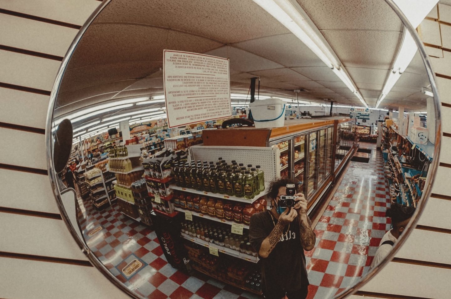
Starting with supermarkets, there is an almost universal formula to store layouts enforced nowadays. Flowers out the front, baked goods at the entrance, dairy at the back and cold drinks by the checkouts. Why?
Flowers and cold drinks have the highest profit margins of most goods sold by supermarkets. They’re placed prominently to ensure all shoppers pass them. The baked goods simply smell good. Freshly baked croissants leave shoppers’ mouths watering. Shopping while hungry, they’re more likely to buy. Moreover, milk is one of the supermarket’s biggest sellers. Directing shoppers down the aisles to reach the fridge increases the chance of impromptu purchases.
Then we look at the obvious example of Ikea. Their one way, snaking floor layout forces shoppers to pass every section of the store. In fact, Alan Penn of University College London mapped out the path of shoppers in Ikea in 2011. He found the disorientation as shoppers are pushed deeper into the shelves of homewares removes shoppers’ autonomy and makes them more likely to purchase. Whether intentional or not, his full article is worth the time to read.
Research out of the University of Southern California looks further into the topic. They found that as soon as a product had two nutritional labels, shoppers struggled to differentiate between healthy and unhealthy foods. Marketers exploit the confusion caused by chaos. Moreover, characters on cereal boxes look down at 9.6 degrees on average in order to make more direct eye contact with children.